“App Market Media saw a 300% increase in Revenue with Affise. The сompany commits to generate efficient user-engagement strategies through performance-based models to ensure the maximum ROI for clients.”
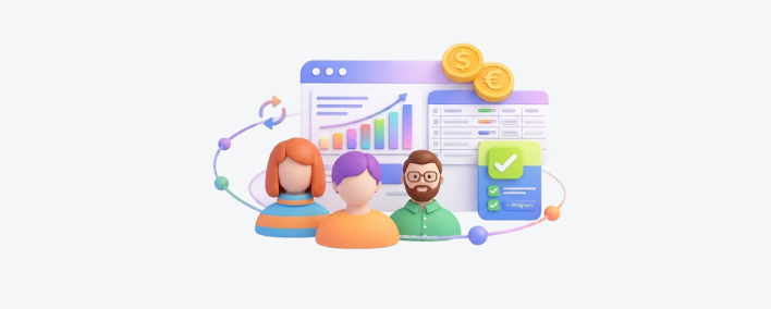
6 Tips for Creating a Landing Page for Affiliate Marketing That Converts
6 Tips for Creating a Landing Page for Affiliate Marketing That Converts
All marketing campaigns need a landing page, and affiliate marketing is no exception. But is your page doing its job? How do you create a landing page that attracts the right visitors and maximizes conversions?
In this post, we’ll show you some top tips for designing a high-converting landing page that stands out from the crowd with vibrant design and audience-specific messaging—and helps you make the most of any affiliate program.
First, let’s cover the basics.
What is Affiliate Marketing?
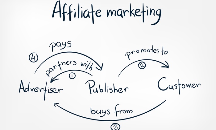
Also called performance or partner marketing, this is a type of digital marketing in which a company’s products or services are promoted online by a third party (an affiliate) using strategic links. It’s often used by SaaS companies, retailers, and ecommerce merchants.
This is beneficial for merchants looking to promote their products or services, and affiliates (usually bloggers or everyday marketers) who earn commissions for promoting the company’s links. Both parties often join affiliate networks that bring merchants and affiliates together.
When a company and an affiliate form a partnership, this is known as an affiliate marketing program. This is a form of pay-per-action advertising, not to be confused with the pay-per-click (PPC) model.
To manage the relationship effectively, you can use an affiliate management platform such as Affise—which helps you to automate and scale partner relations. Affise Reach enables global brands and agencies to partner up and expand their marketing channels, with access to a greater variety of partnerships in one place.
Benefits of Affiliate Marketing
Affiliate marketing increases brand awareness and web traffic by promoting your company across a range of marketing channels. Even if you don’t have much of an online presence, your affiliates will—which means there’s a ready-made audience for your products and services.
It’s low-risk and cost-effective, as you only pay commission when an affiliate link actually achieves results. It will also save you time and money, as you’ll generate traffic and sales through partner links, so you won’t need to rely so heavily on traditional marketing methods. Backlinking also boosts your SEO.
Source (neilpatel.com)
Partner marketing helps to build credibility, as potential customers are more likely to trust a separate source that praises your business. Marketing partnerships also allow you to share experience, strategies, and resources. In ecommerce, for example, this would include customer referrals and joint marketing.
The more affiliates you have, the more you’ll need robust technology (such as Affise’s built-in analytics) to track and manage your performance marketing, such as conversion rate ecommerce and changes in ROI.
(If you’re already using an affiliate platform or an in-house solution and you want to upgrade, Affise makes it super-easy to migrate.)
What is a Landing Page for Affiliate Marketing?
A landing page is a type of web page, created specifically for a marketing campaign. When potential customers click through from an email or digital ad, this is where they will land.
A landing page is designed purely to encourage visitors to complete a specific action, such as filling out a lead capture form with their email address. It must include a “call to action” (CTA) that makes it clear what the visitor has to do and what they’ll get in return (such as special offers and relevant content).
An affiliate marketing landing page needs to help publishers and influencers to drive as many promising leads as possible to take the action they desire of them.
Why Do I Need a Landing Page for Affiliate Marketing?
The strength of your affiliate landing page can mean the difference between the success or failure of an affiliate marketing relationship. It has to be designed in just the right way so that it not only attracts the right visitors but also persuades them to complete the desired action.
A clear and concise landing page simplifies the process of directing people into your funnel, and enables you to increase your database or email marketing list. It also has the bonus of giving the visitor a great user experience, which also helps increase conversions.
Source (blog.hubspot.com)
There are two types of landing page: A lead-generation page where people fill in their details, or a pre-lander—an extremely simple version built around a CTA that takes them to the “full” landing page with more information.
Either way, when your landing page is working properly, you’ll bring in qualified prospects who will hopefully turn into profitable long-term customers. And you’ll be spending less money on other forms of advertising. Before we dive into the tips, it’s important to have a well-designed logo that represents your brand and catches the visitor’s attention. If you haven’t already, consider investing in a professional logo design that conveys your brand message and sets the tone for your landing page. All marketing campaigns need a landing page, and affiliate marketing is no exception. But is your page doing its job? How do you create a landing page that attracts the right visitors and maximizes conversions?
6 Tips for a High-Converting Landing Page
There are tons of products and brands for consumers to choose from, so it’s crucial to differentiate your affiliate offer from the competition. Here are our top tips for creating landing pages that really work:
1. Understand Your Audience
Before you think about the actual page design, you must consider the people you want to attract. Use your existing data and insights to analyze your target audience’s demographics, preferences, and behaviors. How do people interact with a particular ad or post? Which ad campaigns bring you the most sales?
Knowing the statistics about your target audience will help to make your marketing campaigns more personalized. Affise offers statistical analysis for partner marketing, which you can use to create a simple, appealing landing page that answers the audience’s needs through tailored design, copy, and CTAs.
It’s also a good idea to provide value to your potential customers for free—everyone loves a freebie, after all! This is called a “lead magnet”, which is usually content given away to your audience in exchange for their email addresses. It might be a webinar or consultation, an ebook, or a software plugin.
For example, if you wanted to promote small business phone systems, you might invite people to sign up for a free trial or demo—so they can enjoy using the features and decide they can’t live without them.
2. Stand Out From the Crowd
Your landing page has to be eye-catching in order to grab prospects’ attention—don’t risk them being underwhelmed by the design or content and navigating elsewhere before completing the desired action.
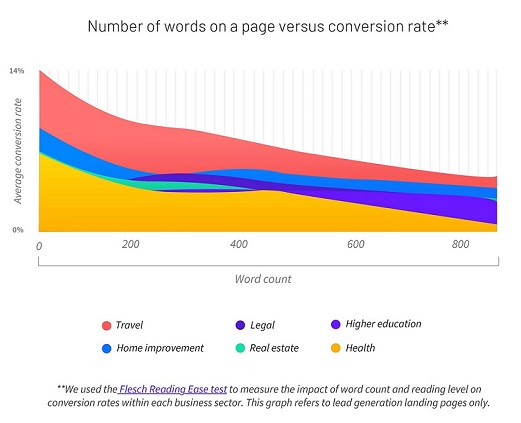
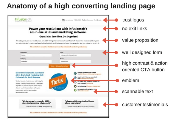
Come up with an engaging and catchy header that encourages them to read more, plus at least one attractive image that’s relevant to the content (this can be a photo or a graphic). Visual elements are important as humans tend to respond to them better than to written copy, but make sure they don’t distract from the main message.
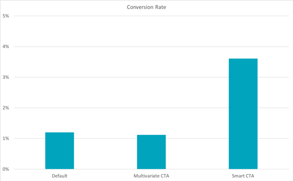
Your CTA button is the key feature of the page, so it must be clearly visible without having to scroll down. In fact, including it more than once will help you get more clicks. Make it stand out by using a vibrant color that contrasts with the background design, and use short, persuasive words such as “Try for free”, “Learn more”, “Sign up”, or “Get started”.
Source (blog.hubspot.com)
You can test the performance of your CTA with A/B testing (more on that later).
3. Keep Things Simple
Your landing page has one job to do, and that’s to get visitors to complete an action. It should be easy to see what the idea is, what you want them to do, and what you’re offering in return.
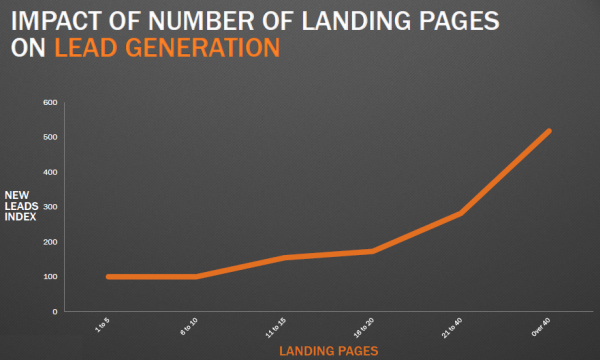
Don’t confuse people with too many design elements, annoying pop-ups, or information that’s not directly relevant. Landing pages with multiple offers get 266% fewer leads than single offer pages.
The benefit statement (a summary that shows your prospects the benefits or value of the offer) should be short and sweet—this is not the place to list all the features of your affiliate products. This happens further down the page, where you can go into a little more detail. For instance, to go back to the phone system example, it’d be there that you can go into how easy the porting number process is.
However, you still need to keep all written copy short and compelling, and back up any statements with facts. For example, you could use bullet points or colored boxes to describe the main benefits of the product, and include a section below with more details.
Source (medium.com)
This brings us to the page design, which shouldn’t look cluttered or clunky. Make it minimalist and easily readable, so that visitors can focus on the main point of the page. It goes without saying that you’ll use your company branding to keep the landing page consistent with the rest of your site.
Even if you don’t know the first thing about HTML, you can find plenty of landing page templates online with easy drag-and-drop elements. You could also use a WordPress plugin or turn to one of the best landing page builders such as Unbounce, Instapage, or Leadpages.
4. Add Social Proof
If you want people to take an action, it’s important to demonstrate that you’re (or your company is) credible and trustworthy. As well as providing stats to back up any claims you might make, it’s well worth adding social proof to your landing page.
Social proof is basically evidence that other people have found value in your product or service. Endorsements include reviews, testimonials, use cases, or posts from social media such as Twitter or Facebook. Recently, video testimonials have also become popular. One study found that 36% of the top converting landing pages included testimonials from customers or clients.
This provides a crucial trust signal for anyone considering a conversion. All social proof examples should include details such as the person’s name, title, and company—and maybe even a photo, especially if it’s a well-known person in the industry.
5. Make Sure it’s Fully Optimized
For a high-quality affiliate marketing landing page, you have to optimize all the elements to ensure a great user experience and maximize conversions.
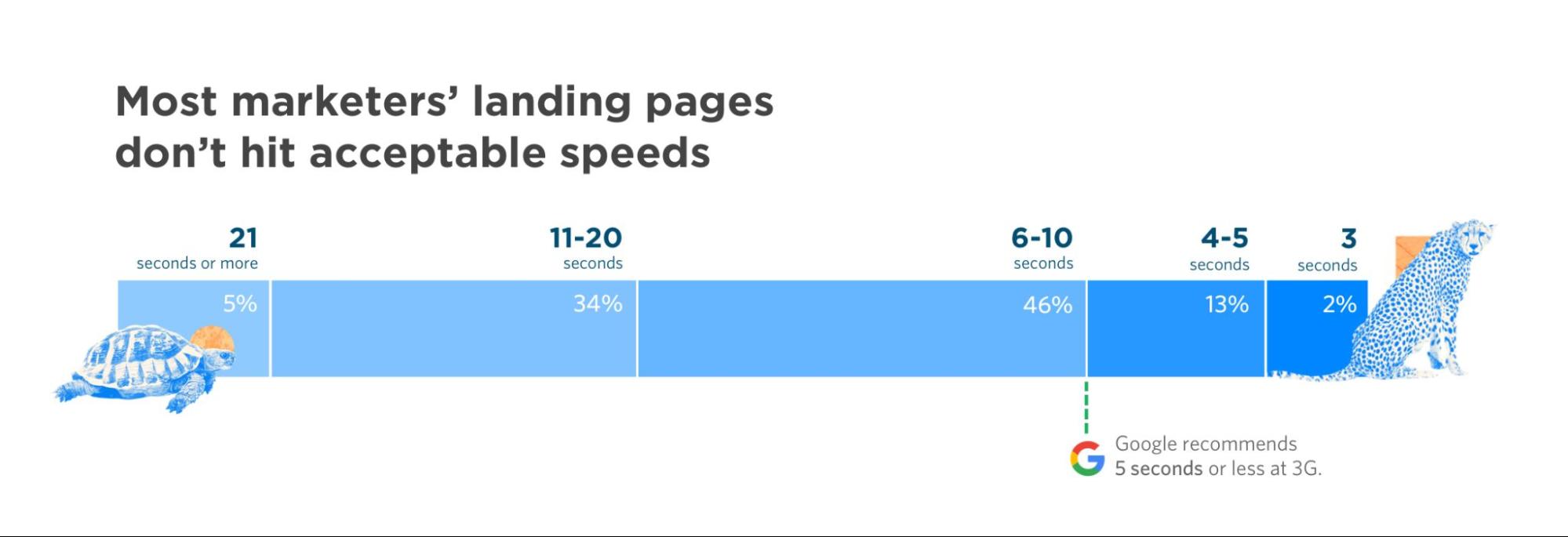
Speed is important—visitors won’t want to hang around for a slow-loading page. (Nearly 70% of consumers admit that page speed impacts their willingness to buy from an online retailer.) You should regularly test your page loading speed and check for problems caused by unoptimized images, missing files, or plugins with compatibility issues.
You can boost your page’s speed by minimizing redirects and enabling browser caching.
Source (unbounce.com)
It’s also vital that your landing page is mobile-responsive, as so many people access the internet on their smartphones these days. The page should render in the same way as it would on a computer, with fast loading and consistent messaging. Since Google introduced mobile-first indexing, mobile optimization is also important for your SERP rankings.
You can ensure your content is optimized for SEO by using Google Analytics to monitor the search queries people use to land on your page. This will help you keep your written copy specific and conversion-driven.
Finally, look at your competitors and take inspiration from successful landing pages—how their message is presented, what trust signals they include, and how they ask visitors to opt in through CTAs.
6. Monitor, Test, and Experiment
As well as checking that your landing page is fully optimized, you need to make sure that it’s doing its job properly. One way to do this is to use A/B testing or split testing. This is where you create more than one version of the landing page, and analyze which gets the best results.
If you want to compare two different versions, you split your page traffic so that half of your visitors land on version A and the rest on version B. Within those versions, you can test page elements like the CTA, benefit statement, layout, copy, headlines, and images.
In terms of metrics, you should be measuring the time visitors spend on your page, the bounce rate, and the conversion rate. Affise provides full tracking, attribution, and analytics, which is a major reason why people migrate there from other affiliate management platforms.
With Affise, you can even rename metrics or create your own columns with unique formulas. The platform also includes CPAPI, a fast and scalable system that allows you to unify all your data instantly. It pulls in offers automatically, and can be used as an integration with any kind of software for performance marketing.
Meanwhile, Affise BI (Business Intelligence) helps you manage unstructured data from various marketing channels effortlessly—and enhance your partnerships with fast and accurate reporting through better data quality.
Source (keap.com)
Create an Affiliate Marketing Landing Page that Converts
Let’s have a quick recap. An affiliate marketing landing page needs:
Attention-grabbing headline
Clear CTA
Concise, compelling copy
Eye-catching visuals
Understanding of the audience
Optimization
Measurable metrics
If you follow these tips, your affiliate landing page will become a key part of your affiliate marketing strategy, helping you attract and convert as many prospects as possible (and make money, obviously).
And as your affiliate relationships grow, you can experience stress-free management and smart analytics with Affise.
Share this article
Written by
Jessica Day
Jessica Day is the Senior Director for Marketing Strategy at Dialpad, a modern business communications platform that takes every kind of conversation to the next level—turning conversations into opportunities. Jessica is an expert in collaborating with multifunctional teams to execute and optimize marketing efforts, for both company and client campaigns.
Sign up to receive our newsletter
Stay on top of the competition. Let us keep you updated with news, insights, and more


